Buttons
This lesson covers quick button customisation in Framer: tweak text, links, and icons from an instance, or jump into the main component to update colours, fonts, and states across every button at once.

Allie Walters
Learnoverse Instructor / Senior Product Designer
Beginner
2:44
Lesson Transcript
Hello and welcome to the first tutorial in this 5 module series on how to use the Learnoverse template.
Each of the lessons has been carefully crafted so that you can dip in and out as and when you need the relevant support.
In this “Buttons” tutorial, you’ll learn how to customise a button for your own Learnoverse.
Framer has made it super easy for you to edit components, so let’s get into how.
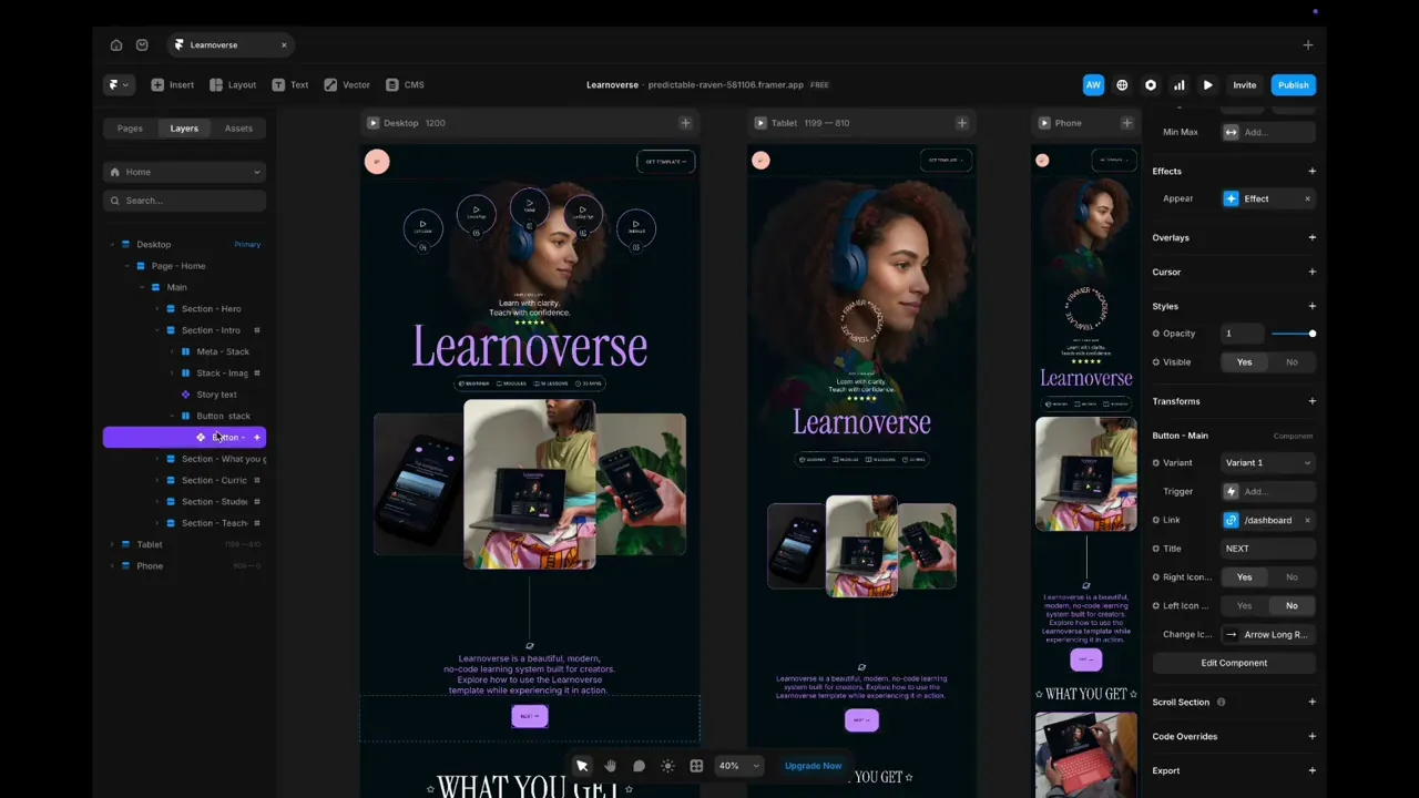
The first thing to do is to head over to your layers panel on the left-hand side. You can see how the layers are structured by expanding on each layer.
You can recognise a component if you see a purple diamond shape.
Here you can see an instance of a button component.
Simply click the button instance and head over to the right panel.
Scroll down until you see “Button - Main” and you will see a few areas that you can edit. You can change the link, button text and icon.
To change the link, simply click the link, and you will see a range of other pages to link to.
To hide the icon on the right, simply choose “right icon” “No”.
You can choose to have an icon on the left by clicking “left icon”, yes.
To change this icon instance, simply click the arrow and choose another icon. You can do this by searching or scrolling through your options.
To make global changes to the button, such as colours and fonts, simply double-click the button, and you will see the “Button- Main” component page.
Here you will see two buttons. The primary button has three variants with different states. These variants are “default”, “hover” and “pressed” states.
It’s important to note that if you wish to make changes, such as text changes, the easiest way to do this is to update the primary button, which is “variant one - primary’.
To change the colour of these, simply click the primary button, head over to the panel on the right to change the colour, or add a new colour.
Then, to change the hover and pressed colour states, do the same.
You can rename the colour style by right-clicking on the name and editing.
You will also see a secondary apricot-coloured button, used in the top navigation bar. You can change this in the same way.
To change the text, follow a similar process by clicking the text link, heading over to the panel on the right and changing the text style.
Start customising your buttons, and I’ll see you in the next tutorial.