Progress
This lesson covers dashboard progress tweaks in Framer: edit the Badge Title globally and customise the progress widget’s styles and percentage states via its variants.

Learnoverse Instructor / Senior Product Designer
Allie Walters
Beginner
2:01
Lesson Transcript
Welcome to this “dashboard progress” tutorial, part of a 5-module series on how to use the Learnoverse template.
In this “dashboard progress” tutorial, you’ll learn how to customise this component for your own Learnoverse.
Let’s get into how.
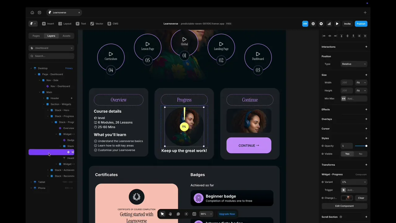
Head over to the left panel in Framer and ensure you are on the “Dashboard” page.
Click the “layers” panel at the top to expand all layers and see how this section has been structured.
The component named “Badge title” can be edited in the right-hand panel on Framer. To edit the component design itself, double-click and make changes there. Please note that this badge component will update every instance across the Learnoverse template.
You can make simple edits to the “Widget - progress” component by heading over to the right panel, choosing the variant that is most applicable e.g 1%, 25%, 50%, 75%, 100% and editing the picture. It’s important to note that, as this is a template, there is no code attached to this widget; it’s for display and motivation purposes.
You can edit the “Widget - progress” component by double-clicking the component indicated by a purple diamond.
Once you’re on the “Widget - progress” component page, you can change the colours, styles, and shapes.
To change the percentage target, simply click on the primary component, which is the first wheel, head over to the right panel, and under interactions at the top of the panel, click for example, 25%. Then change the variant it interacts with in the variant dropdown.
That’s it for now.
For more information on how to edit text styles, colours, padding, shapes, and scroll sections, head over to the official Framer Academy resources.
Start customising your progress widget now, and I’ll see you in the next tutorial.